Kill.Switch - Unsexy Relics of History
13/02/23

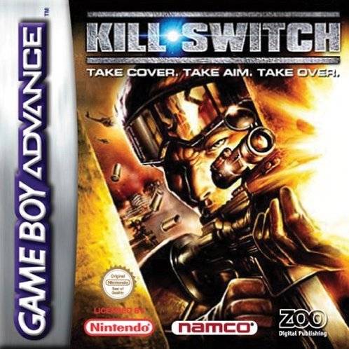
I’ve frequently said (or at least I think I’ve said - my memory is more like a pasta strainer than anything else) that demakes are some of the most fascinating games in existence, especially in the case of a home console game getting a port or new version on a handheld. Of the games I’ve messed around with over the years, Kill.Switch is amongst the most fascinating - The original being not only a classic PS2/Xbox third person cover shooter, but *the* original third person cover shooter, birthing a style of gameplay that would be perhaps the most common in the very next generation. It was a meaty, involved shooter, especially for the time… so how well does it fare in a devolved state on the Game Boy Advance? Well, let’s jump in, and find out.
I really want to know who decided Kill.Switch needed a Game Boy Advance version. Whilst I couldn’t find any sales information for Kill.Switch’s console editions, the fact that the Game Boy Advance edition of the game came out almost a year later implies that it sold very, very well, and the chance to get the handheld slice of the pie was almost too scrumptious to resist. As I’m sure you’re aware, the Game Boy Advance isn’t exactly known for its bevy of shooters, and I’m sorry to say, Kill.Switch is not going to buck that trend. It’s not… atrocious, I guess, certainly not on the level of some of the worst this little website has tackled, as I think there’s historical, technical value to Kill.Switch’s presence on the Game Boy Advance. Technical in the sense this game exists at all, otherwise… yeah, let’s just dive into this.

Kill.Switch, much like its console predecessors, is a third-person, cover-based shooter where you find yourself in the shoes of a nameless soldier partaking in a variety of combat missions across the world. The gameplay is fairly basic in structure - you’ll be moving through linear, corridor-esque combat zones, weaving in and out of combat as you blast through The Enemies Of America with machine guns, shotguns, and grenades. Much as with its parent title, Kill.Switch’s greatest deviation from other shooters is its cover system, allowing you to slide behind walls and crouch behind conveniently waist-high cover to fire upon The Enemies of America with relative safety. You can peek out or just blind fire if you don’t care for accuracy, though that’s not gonna cut it with more distant foes. As a whole, it’s feels standard when compared to other third-person shooters, but the fact that you’re actually playing a goddamn *third person shooter* on the goddamn Game Boy Advance gives the game a kind of exotic appeal… in spite of, y’know - actually playing the game.
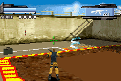
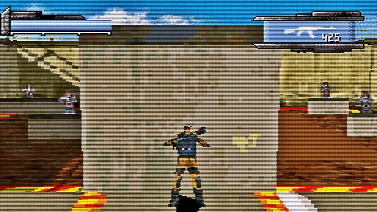
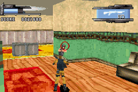
Now, the biggest thing you’ll notice, either from these screenshots or perhaps you inevitably looking up how Kill.Switch actually looks, but yeah. This game is ugly. Whilst it’s impressive they made a genuine pseudo-3D game on the GBA, it came at great, great cost. Kill.Switch is almost consistently a blurry mess of pixels and nothing else, causing massive issues in regards to identifying foes, items, and even the most basic facet of a third person shooter - getting shot. Genuinely, this is probably the ugliest game I’ve played yet, or at least in the same ballpark as American Idol, or Crazy Frog: Racer. Man, I wanted to be a kinder person this year, and I’m pulling out insults like that!? What have I become!? Seriously though, look at some of these screenshots! In what universe does that look like a man!?

These graphics, and the developer’s lofty aspirations for a third-person GBA shooter, leads the level design to barely existing in the first place. Kill.Switch’s areas are barely areas at all, simply being varying colors of dull, stone corridors, no matter if you’re outdoors or indoors. Enemies will be randomly throughout, frequently in annoying positions that make it nearly impossible not get the living shit shot out of you, and even the level objectives barely vary, pretty much just considering of ‘get to the end of the level’, ‘find the bombs’, and ‘get to the end before the time runs out.’ Oh boy, variety, right? At most, I can imagine different color palettes and little else - gray stone, yellow stone, you know, the perfect representations of real life countries, right? It’s impressive that they got a polygonal game going on the GBA - the amount of which exists on the GBA I can probably count on one hand - but I think it cost the game far, far too much in the graphical department. I’m sad to say the graphics - and the issues that come with it - are the main reason I dropped this game about halfway through, and considering how short this game seems to be, at a scant couple of hours, that’s pretty telling, isn’t it?
And as I said, much of the difficulty of this game just seems to come from the fact the graphics and combat is just fighting you at every step of the way. The biggest issue is that the control scheme is just far, far too complex for a game on the GBA. Now, I played this via emulator on my 3DS, so I had the advantage of a slightly more ergonomic ‘controller’, so to speak, but even I struggled to adjust to how Kill.Switch controls. Rather than just having a button to shoot, to actually fire your gun you have to hit both the L and R buttons at the same time, then aim - without moving - with the D-Pad, and then firing with the A Button. It’s just complicated enough that I frequently found myself hitting the wrong buttons here, leading me to just popping out of cover and getting shredded as I try to remember what I’ve actually done. The tutorial doesn’t really help this matter, either - it just does such a poor job of explaining how gunplay and grenades work, you really just need to get that muscle memory down… and that muscle memory doesn't want in on Kill.Switch. And on the topic of enemies - even if enemies are as far from you as possible - to the point you can’t even hit them with any kind of accuracy - stepping even briefly out of cover will hit the player with a complete blizzard of bullets. Didn’t matter if they were in my line of sight or not, out of cover frequently just ended up in death, no matter how brief such movements were. Plus, the fact the enemy ‘models’ are so blurry and undefined, sometimes it can be impossible to tell if they’ve aggroed to you or not.

I don’t want to just completely dump on Kill.Switch; as I said, I love demakes as a concept. And the fact that the developers of Kill.Switch actually made - in a manner of speaking - an actual polygonal third person shooter on the GBA in 2004 is honestly pretty outstanding. It’s not a particularly *fun* time, but I think games that really pushed the limits of the Game Boy Advance - for better or worse - are worth remembering, and even messing around with. Kill.Switch may stand out for all the wrong reasons, but I’ll never forget - not just for its horrendous looks, poor control scheme, or repetitive gameplay loop. It really shows that the team behind Kill.Switch had a lot of passion and drive to bring a pseudo 2D third person to the compartily boneless GBA… and if anything else, I think that shows that Kill.Switch deserves to be remembered.
Thanks for reading my review of Kill.Switch on the Game Boy Abyss! Sorry that I didn’t end up uploading last week; I’m back at work now, and I’ve been bloody exhausted. I’ll have a review up next week instead of having it be a break week, and we’ll be taking another look at a shovelware title I doubt any of y’all have actually played. So, uh, look forward to that! As always, if you have any questions or requests, you can email me at cckaiju@gmail.com. Thanks again for reading, and I’ll see you in the next review.
